$10 Gift Voucher - Leave a Comment

Posts Tagged ‘Tutorials’

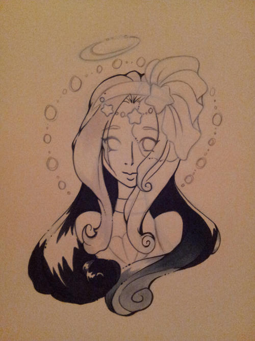
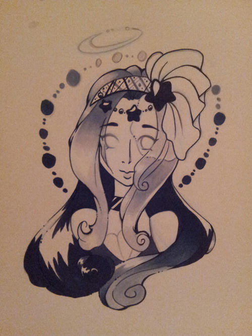
My Favorite Things – Skin Coloring with Copic Markers

Written by carisa_zglobicki. Posted in Tips & Tricks, Tutorials

Hi everyone! Today I’m going to show you how I colored the skin on this adorable image by My Favorite Things called My Favorite Peep! I just love it because my entire family excluding me LOVES those peep things! haha Anyway, let’s get started and bear with me as this is the first time I’ve photographed a step by step tutorial like this with coloring or at least it has been awhile. 
 
First, I want to mention I stamped my image with Memento Tuxedo Black ink on Copic Blending Card Paper Mini Pack. This paper is already cut at 4.25 x 5.5″ so it is a great size to stamp images without having to cut down a full 8.5 x 11 sheet of blending card. I also want to mention that when I first got this paper, I was expecting it to be the same as the Copic Xpress It Blending Card but it’s a bit thinner so your markers bleed a lot more through the paper but they still blend beautifully and I haven’t noticed any bleeding outside the lines of my stamped image.
 

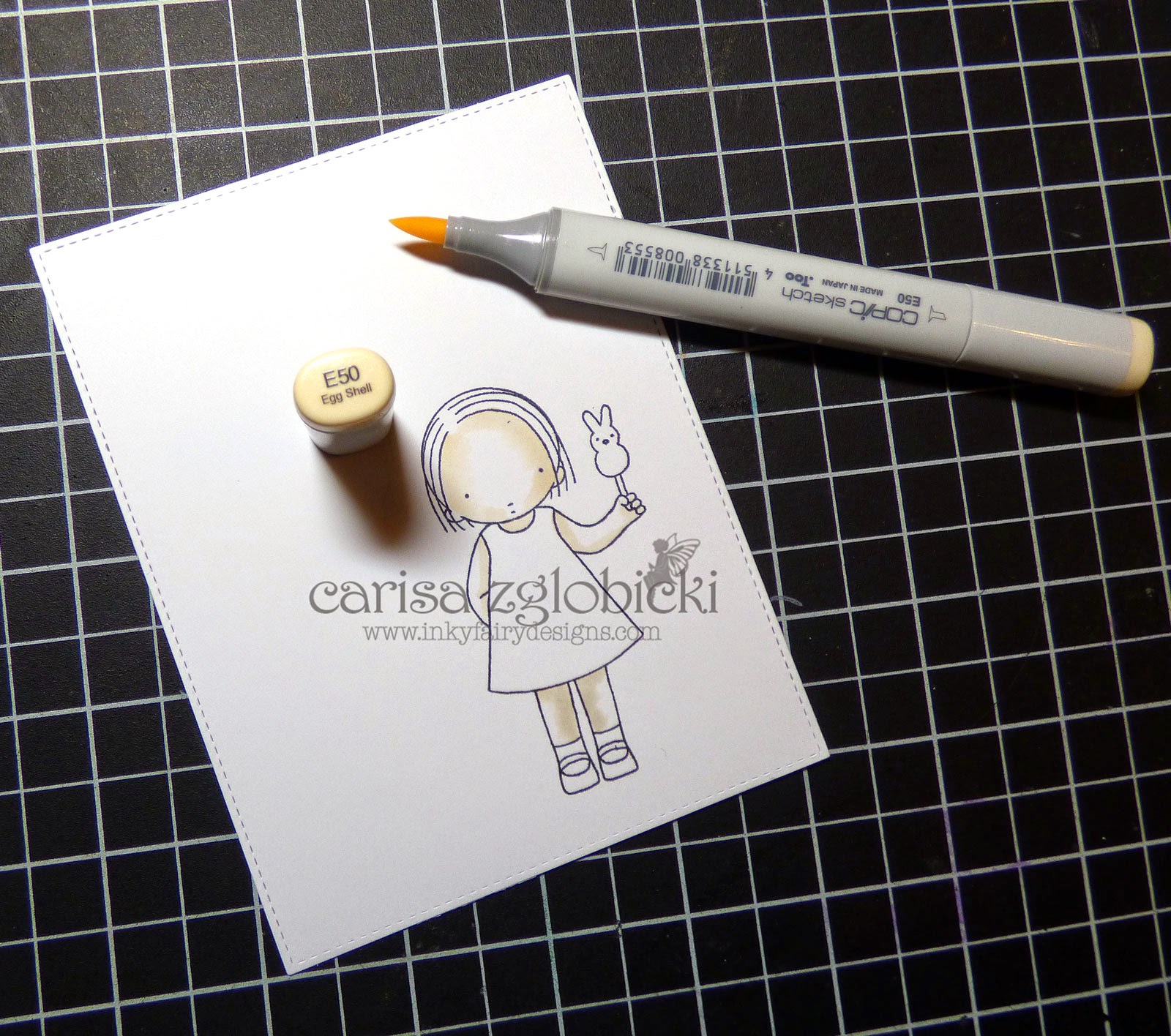
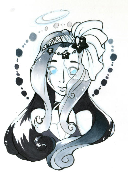
Step one: With skin I almost always color light to dark, so I’m starting with laying down my lightest color in this case E50. I’m just really mapping out my shadows here.

Step two: Building up our color by laying down the next lightest color E51. Again just mapping out our shadows bringing the color just a tad less than the last time.

Step three: (disclaimer: I actually missed the real step three with was laying down E11.) See, this photographing tutorial is a bit harder than it looks!) Anyway, so this is E21 and I just went around the image closest to the hair line and where I wanted my deepest shadows to be, just a very thin line.

 
Step four: Now that our darkest color has been laid down, going in reverse order (E11, E51, E50) we are going to blend all of that back out and depending on what you like, you may do a little more blending here as well. This is what your image will look like when that is done.

 
Drop Shadow: This is where it gets fun. Now that our skin is completely colored, I am going to use BV20 as my drop shadow color. Why do I use BV20 and not another darker color from the E family? I use BV20 because using this cool color gives a more realistic shadow to our image. Try it next time you are coloring – you will be surprised at how your image really comes to life!

 
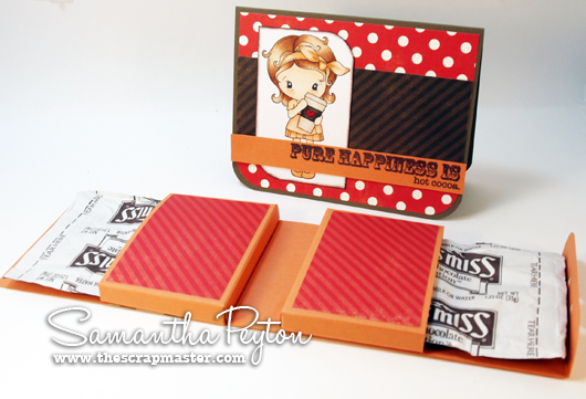
Here she is again all colored up on a card using one of the sentiments in the stamp set. I love creating a clean and simple card to really let the image be the center of attention on a card sometimes. I also used a white gel pen to add the polka dots on her little dress and clear Wink of Stella on the peep!

Here is a list of all the colors I used on the image. I hope you enjoyed this tutorial today and don’t forget to join us in our Anything Goes challenge! We love to see what you are creating with your favorite markers! 

Carisa

Coloring With Hikka! Week 49

Written by Hikka. Posted in Eye Candy (Projects), Tutorials

I won’t lie…my own birthday distracted me this week. BUT! I got a little somethin’ somethin’.

Just a sketch I had lying around, decided to play around with grayscale again. Drawn on copic sketchbook and inked with Copic Multiliner SP + cool gray and of course shaded in with some ShinHan Touch Twin Brush markers.

 I started off with just inking the hair, was mostly giving super duper high contrast a try, so I didn’t line everything right off the bat, just wanting to keep my focus one place at a time. So I start off with 120 for the major part of the hair. While some parts were done with tip to tip blends of CG0.5, BG3, BG7, BG9.

Then to add in some more details, part of the top was done with CG9, while the stars and collar were shaded in with ink. The headband was inked with black and cool grey. Also, there is a veil, which some of the hair was under, so i of course used my colorless blender to create the transparent look with CG0.5 and a tiiiny tip to tip blend of CG0.5 and BG3. Then for quick decoration, CG9, CG7, BG7, BG3 and CG0.5 for the circle background.

 Then for a bit of sparkle, I added in a little bit of Copic Opaque White and did some color pencil in the eyebawls.


Here Comes Frosty! A Coloring Tutorial by Marie

Written by Marie Gamber. Posted in Tips & Tricks, Tutorials

mp103914a

Hello everyone!

The Holidays are coming and I wanted to get started on some Holiday cards!

When this  adorable stamp stamp  arrived in the mail, I just knew it  was too cute to pass up
and kept it  calling my name!
Have YOU ever had that happen?! LOL

I wanted to share my technique for creating “Extreme Shading with Warm Gray”.


:

Other YouTube Tutorials HERE

mp103014b


SuppliesChrstmas

Stamp
Be Jolly (Avery Elle)

Ink
Copic Alcohol Ink Markers
Copic Opaque White Ink
Copic Colorless Blender
R
ed Colored Pencil

Paper
Card Base: Heavenly White 120# White Cardstock
Focal image: X-Press It Blending Card
Designer Paper:  Holly Lane (WRS)
Layer Paper: Bazzill Card Shoppe – Lollipop

Other
Crafter’s Companion Double Sided Adhesive
Zig Wink of Stella – Silver
Diamond Stickles (Ranger)

mp103014c


I used the “Be Jolly” sentiment that comes with this stamp set.
I used a red colored pencil to add a
candy cane effect.  Fun!

mp103014e

I hope you enjoyed my tutorial!
I will be back Friday of next week – November 7th

I hope you stop back tomorrow
and see the fabulous creation Kelli has in store just for you!

badge_marie

Hot Cocoa For Two Treat Box

Written by Samantha Peyton. Posted in Uncategorized

Hi everyone! Samantha here and I want to share the little treat box & matching card I made for my husband for this past Valentine’s Day. I think this would be a perfect little anytime treat box to share with a friend, family member, neighbor, etc.

It is a hot cocoa treat box, built to hold two hot cocoa packets!! I only has Nestle & Swiss Miss in the house, but both of them will fit this treat box. I am guessing other packets would fit in here also 🙂

To make this treat box:

  1. Cut pieces of cardstock the following sizes: one piece at 3.5X12inches and two pieces at 5.5X3.5
  2. (Scoring guides are at the very end of this post if you need a visual of the scoring). Score along the 12 inch piece at the following: 5inch, 6inch, 11inch. Fold along score lines. This piece will be the outside of the treat box. The outside of the treat box can be decorated as desired.
  3. For both of the smaller pieces: Score along 3 sides (two sets of score marks on the 5.5inch side) at 5/8inch and 1inch. Trim off the corners where all the score marks cross and fold into 3sided “pockets”. The front of these can be decorated with patterned paper like shown (patterned paper was cut to 3.25X2.25inches).
  4. Attach pockets to box. Punch holes for twine. Fill with hot cocoa packets and tie the box closed with the Orange Divine Twine.

Here is a closer look at my coloring. I used this adorable image from CC Designs called Kiki La Rue Latte.

I used the following Copic colors:

  • For the lightest part of the cup: E40, E41, E42
  • For the darker band on the cup: E44, E47, E49
  • For the heart: R29
  • For her hair: E30, E33, E39
  • For the clothes: YR000, YR00, YR01, YR12
  • For her skin: E000, E00, E01

Here are the scoring guides in case you are a visual learner 🙂

Dotted lines are score lines and arrows indicate which direction you start scoring from. Solid lines are cuts. The grey parts are cut away.
 
Scrapmaster’s Paradise

Grab Our Button

i Luv MarkerPOP
Show some MarkerPOP LUV,

add this button to your blog.

I’m a Winner!

I'm a Winner on MarkerPOP Blog
Copy and paste the code under the badge

to claim your bragging rights!

I’ve Made Top 3!

WoHooooo I made it to the Top 3 on MarkerPOP Blog
Copy and paste the code under the badge

to claim your bragging rights!

Visit Us!

MarkerPOP Free Shipping MarkerPOP Boutique
18299 Mount Baldy Cir
Fountain Valley, CA 92708
Toll Free: 1-855-312-1222
Phone: 1-714-249-1222