


Winners and Wanda
Hi everyone! Before we get to Wanda’s gorgeous project for today, we have some winners to announce!! The following lovely peeps have won DIVINE TWINE!!
Winners chosen from Blog
#20 burg princess’ world
#13 Jacilynn
#8 TeacherMom
Winners chosen from FB
#2 Nana Nassar
#11 Ashley Nguyen Newell
#7 Kandi Evensen Gallegos-Garcia
Congrats winners, please email info@icopic.com with the subject line “Baker Twine Winner Blog/FB” and include your mailing info.
Hi there! It’s Wednesday…so It’s my fun day for posting here on the iCopic Blog ! For this card, I’m using the sweet Birthday Anya stamp! Do you guys remember that Baskin & Robbins Commercial that goes Ice Cream and Cake, Ice Cream and Cake?” I LOVE that commercial! It’s silly and fun and happy. This card reminds me of that – nothing but happy birthday cheer! I hope you likey. Have a great day today!
One tip I have for you – in order to get your projects to match your patterned paper…choose your patterned paper first! Then, select your marker colors to match. Your projects will look professional and clean.
Marker colors: E00, E000, RV10 (face) Y21, Y35, Y11, E31 (hair) YR01, YR02, B02, B04 (dress and cake)
Tuesday Tips and Tricks: Warm VS Cool Gray
Hi everyone!
Samantha here with some black and white coloring for you! Make sure to enter this week’s challenge, which is to color in black and white! Click here to go to our challenge.
When coloring in black and white, most of us have two options: Cool Grays (Labeled C) and Warm Grays (Labeled W). There are other sets of grays in the Copic collection, but these two are the most common so I wanted to talk about them.
Usually the grays are used for shading and shadows, but what set of grays you use depends on the main colors of your image.
Cool grays are supposed to be used with cool colors such as blues, blue-greens, blue-based reds, and pinks, purples.
Warm grays are supposed to be used with warm colors such as yellows, oranges, browns, and orangey-reds, and yellowy greens.
To make it easier, I found this graphic for you. A good rule of thumb is, warm colors are yellow based, where as cool colors are blue based.

I will talk more about color theory and shading in other Tuesday Tips and Tricks segments, but today, I want to show you the difference in coloring solely with the grays.
When coloring only with grays, you can do your shading just as you would if you were using any other color family. You can still get beautiful shading and nice looking light and dark areas of your image.
For my coloring examples for today, I used an adorable stamp from a stamp set from Pink Cat Studio, which is available in the iCopic store. Pink Cat Studio stamps are SO CUTE!!!
Below, I colored the same image two times. The one on the left is colored with Cool Grays. The one on the right is colored with Warm Grays.

Here is the cool gray colored image. You can tell, the gray is more of a steely blue gray color. In my opninion, the cool grays tend to look more like what I would typically think of as “gray”. To me, this looks more like an image taken from a normal black and white photo.

Here is the warm gray colored image. The warm grays have a yellow or golden look to them. To me, the warm grays tend to look more antique or vintage when used like this. This reminds me of the look of a sepia black and white photo.

As you can see, depending on what grays you use, you can achieve much different looks to your stamped images!
Next, I did something a little different. In the following images, I added just a little POP of color! I used RV10 and RV13 to add a little color into the images. On the left is the cool grays and on the right is the warm grays.

And here are the close-ups with the color pop. This one is the cool grays.

And this one is with the warm grays.

Now that you have seen some examples using warm grays and cool grays, pull out your Copics and get to work on your challenge project for this week! I hope that you will give this a try and I can’t wait to see what you make!

iCopic Challenge #23
Hey everyone!
Like I said last week, we are going to mix up our challenges! And the mix up starts today! Your challenge today is. . .
Use ONLY Black and White to color in your image with one accent color of your choice. I want to see your best black and white coloring!

This week’s prize for the Black and White Color Challenge is the Coloring Techniques for Card Making book. This book features over 20 color pages of techniques including Blending, shadowing and shading for Copic Markers. As every entry inspires us, we hope this prize brings inspiration to its users giving new ideas on how to use your Copics to create beautiful cards. The step by step instructions have room to add in your own creative ideas and help its users jump start a variety of card making projects. The rest of the book offers techniques to adding extra touches to your cards at beginner and intermediate levels.

If you have never colored in black and white only, check back tomorrow, because I will have some examples for you for Tuesday Tips and Tricks!
Also here are some great videos I have found on Youtube about coloring this way:
The official challenge rules are linked in the sidebar. Challenge entries are due Sunday, April 3rd at midnight EST. Good luck!
And the winner for Challenge #22 is Kate C (Card #8). Please email us (info@icopic.com) your shipping address, thank you!

Enter your project below:
Finn Whistling a Hello ~
Hello, hello! Hope you all are doing fantastic on this fine Friday! Alyssa here with a sweet new Stampavie image, Finn Whistling While He Works. The artist is Sarah Kay, and she draws such darling children! These are very detailed images, so you have to use a light hand when coloring with your beloved Copics. The end result is so worth it though!
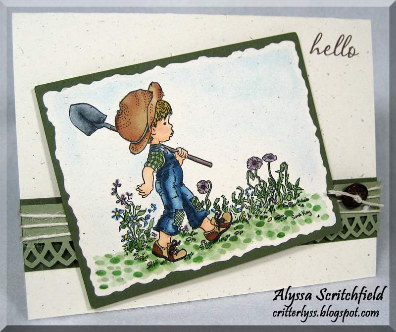
He is stamped with Memento Tuxedo Black on a rustic cream cardstock. This neutral cardstock takes a little bit of practice because it bleeds more than papers designed for Copic coloring. Make sure when you are starting out with your Copics or coloring on a different medium to test out on some scrap…you might just ruin your whole project if you don’t! Don’t ask me how I know! lol
I tried a different technique for the ground cover and just dotted the greens around – YG61, YG63 & YG67. I wasn’t impressed with how harsh it looked at first, so I ran the 0 Colorless Blender over it a bit and then added some more dabs of color here and there. I think this technique still needs a bit of work before I’ll be totally happy with it, but hey, we’re all learning here! :o)

Copics used:
B91, B95, B97, B99, C1, C3, C5, C7, E000, E00, E11, E31, E33, E37, E71, E74, R20, V95, V99, Y15, Y21, Y26, Y28, YG61, YG63, YG67
Thanks so much for stopping by! Don’t forget to play along with the current iCopic Color Challenge for your chance to win 6 Copic Sketch Skin Tones I! :o) lyss
