
Light Skin Combo and Light Source

Hello everyone! Marie here with another mini video and step tutorial for you!
:

I shared a basic color combo for light skin tones on the tutorial, Angels Among Us. Today, I am adding one more color to the combo to provide a darker cast shadow and darker skin combo. It is amazing how different the combo will look by adding just one more marker!
 E11, E00, E000
This is the combo we used in Angels Among Us.
 E21, E11, E00, E000
I will add a “sandwich” of E11, E21 and E11 for high intensity
And now look what a difference is is when we add just one more color in a “sandwich” technique! The contrast has really increased! It is a way to add contrast and really expand your Copic Combos in an economical way.
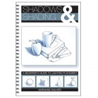
Shadows and Shading Book: A Beginners Guild to Lighting Placement by Marianne Walker.
I also want to introduce you to a wonderful book that is helpful for understanding “Light Source and Shadows”. Consistent light source and accurate shadows are very important when coloring and image. It’s fun and easy with a few tools. This wonderful book comes with acetate guides that can be used over and over.

Supplies:
Paper: X-Press It Blending Paper (X-Press) Stamp: World Traveler (Little Darlings) Copic Alcohol Ink Sketch Markers (.too Corp) Copic Colorless Blender (.too Corp) Copic Opaque White Ink (.too Corp) Copic Black Multiliner 0.03 (.too Corp) Memento Black Tuxedo Ink (Tsukineko) Crafter’s Companion Adhesive
Copic Markers Used: Skin tones: E21, E11, E00, E000 Hair: C3, C5, C7, C9 Clothing: BV000, BV00, BV2, G11, G20, G24 Shoes: C3, C5, C7 Luggage: C0, C1, C3 and black multiliner accented with G20 and G24
Background: Watercolor Wash

This is an example of using the radial light source guide. The sun is shining from your upper left hand side. The area where the line first touches the image will be the highlight. Area where the line leaves the image will be the shadow side. This can be stamped on scratch paper and the light guide can be placed next to your work for reference.

E000 is my base coat. It is the lightest of my color combo. A smooth light application will allow the other colors to blend easily.

The mid-tone, E00 was applied from the outer edge of the shadow and gently flicked inward towards the highlight. E000 was appled in the same manner. Flicking lightly from the outer edge of the E00 towards the lightest part of the face.
 Suzanne Dean, Color Me Creative Classroom, often talked about a “sandwich”. A sandwich is when you place a darker color in the middle of your shadow colors. For high contrast, I used a sandwich for my areas that had cast shadows or areas that were blocked from the light source. I applied E11 to the area. I colored over the same area with the E21. I then applied E11 on top. The E11, E21 and E11 became a sandwich for my cast shadows. The higher the first number on a Copic Marker, the more gray will be in the color. For example, E11 is brighter. E21 ahas more gray. Grayer tones make great contrast colors or cast shadows. The color really increases contrast in a dramatic way so I used it very sparingly for cast shadows.

The areas were blended with E00 and E000.

A touch of E91 was added to the cheeks. This little World Traveler has been spending a lot of time in the sun! If I did this again I would use R20 for my blush to the cheeks. In my opinion, the E91 is too light for the darker skin tone.
This is my finished card!
I hope you will come back for another mini-video and step tutorial next week!
![]()
Trackback from your site.

Comments (4)
sharon Gullikson
| #
I know you are showing how to color skin, but I really like how you made the ripples in the hat. NICE
Reply
Marie Gamber
| #
Thank you Sharon! I appreciate that!
Reply
Linda K.
| #
wow love your videos!!!! I learn so much from them. Thanks for sharing.
Reply
Marie Gamber
| #
Thank you Linda. I am glad to hear you enjoyed it. That means a lot!
Hugs,
Marie
Reply