


Framing Leaves of Green ~
Good morning to you, iCopic fans! Alyssa here to talk about a little stamping trend with you today. I have noticed the trend in stamping lately with framing an image or sentiment but have yet to find the perfect set…you know, the set where the frame takes up the majority of an A2 size card (4 1/4 x 5 1/2).
I love to make majorly embellished cards, but I dislike mailing them! LOL Mainly, this is because I’m lazy and fail to find the time to run into the post office to do it. Having some CAS (Clean And Simple) cards on hand is just the ticket! For me, a CAS card really pops if the focus is a fabulous sentiment and a gorgeously rich colored image. My trick today is to show you how to merge the two.
After trying to measure a border at 0.5 inches inside the card base and failing miserably, a lightening bolt struck! All I needed was a sturdy but thin template! I chose a thinner cardstock (Georgia Pacific white) to create a template to give myself a 0.5 inch border on an A2 card. I cut the template to size and labeled it so I can pull it out whenever I please.

When I’m ready to make a framed card, I trace the template lightly onto the card base with a pencil. Using the most wonderful creation known to stampers – the clear stamp – I can then either line up my sentiment or image to dissect the frame line. The most fabulous thing about this technique is that you can have as many or as few points dissecting the frame as you like! After all the stamping is completed, I use a ruler and 0.5mm Copic multiliner to trace over the pencil lines.
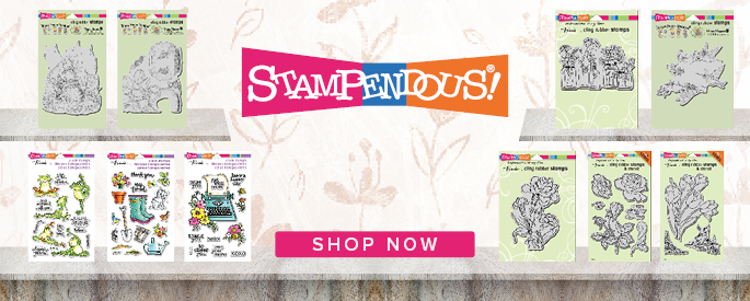
 Back to the pencil traced frame…simply line up your stamps. Here I ‘ve used a floral image to cross over the frame in numerous places. I’ve had these beautiful morning glory images colored up and ready to place on a card for a while, so I pulled them out and placed them on the card front with the pencil drawn frame. I was able to line the stamp up directly where I wanted, gently pull the colored image out of harm’s way and stamp it just where I wanted it!
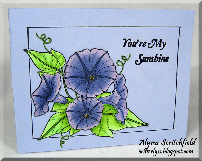
This first card shows how you can use a colored base to make the image the center of attention without making it stark. Since Copics bleed through all the paper I have to color on, I colored the flowers on another piece of white and carefully trimmed around the main image. I left out the little tendrils and a leaf stem in the center of the flowers for fussy cutting purposes and patience! lol These flowers are colored with BV11, BV13, BV17 and a little Y11 in their centers. The leaves are colored with YG11, YG13 and YG17. The tendrils are quickly traced with the deepest color green. The sentiment really pops because it is embossed. It is stamped with Versafine Onyx Black ink and embossed with Filigree detail embossing powder. This is a fun way to really make it stand out! I have a hard time not embossing things these days! :o) *You’re My Sunshine* is an adorable sentiment in such a sweet font from the SP & Company clear set, Rain Boots.

This next card shows how the image can really *pop* when showcased on that stark white base. The flowers are colored with the same BV Copics; however, the leaves are colored with YG63 and YG67…I have the new Sketch YG61 on it’s way and can’t wait to have a shading trio!! The sentiment is from the same Rain Boots set and is also embossed.
Hope you enjoyed my little mini tutorial on framing your images or sentiments! Have a super weekend! :o) lyss
Musical Ethan
Hi Copic Friends! It’s Thursday, and I’m (Linda) here to share a card.
Today’s creation is quite simple, but I like the way it turned out. It is a birthday card for an elderly gentleman so I didn’t want to embellish it too heavily with flowers or ribbons. The background of the card is decorated with blue dotted and green dotted Washi tape. I also covered a piece of scrap paper with the blue tape before I cut it with a Nestabilities die to mat the image. Since the Washi tape is an adhesive I chose not to have thread in my needle when I ‘sewed’ around the image. I used the method Sam introduced in Tuesday’s Tips and Tricks to create the background around the image.

The image I used is Your Next Stamp’s ‘Musical Ethan’.
Card Recipe:
YNS ‘Musical Ethan’ (coming soon to iCopic.com)
Memento tuxedo black ink
X-Press IT blending paper
Copic markers
E00, 11 (skin)
YG0000, 11, 13, 17 (shirt)
B0000, 91, 93, 95 (jeans)
R20, 22, 24 (shoes, cheeks, mouth)
C0, 1, 2 (shoes and ground)
YR000, 20, 31, 23 (hair)
Washi tape
Kraft cardstock
Nestabilities dies
Dymo label maker
Sharpie white poster paint pen
Sewing machine
Thanks for stopping by. Check back tomorrow to see what Alyssa has to share. Don’t forget our Color Challenge #19 from Monday’s post. We love to see your creations, and don’t forget there is a prize!
Linda C
Follow Your Heart Card
Hello! Wanda checking in with ya! If it’s Wednesday it must be my day here at iCopic! Thanks for coming by today to see what I’ve got for you! I hope your week has been a good one! Today’s card is a clean and simple design with Copic coloring. let the color do the talking! I’ve included lots of pictures of my coloring in case you’re following along and wanting to know how I got this look.
Here is my palette. The first color is V12 and the green one that you can’t see the color on is G21. I thought about using Blue Violet but decided to stick with true green and true violet purple.
First step is to put down some gorgeous V17 in the centers. Feather the color outwards from the center in quick strokes.
My second color is V15…going out a bit further from the center color but still leaving white space.
I used my lightest color last to blend all three colors together. Go back over your entire image with the light shade to mix it around and dissolve your pen strokes.
Here are my greens…same concept for the leaves. I started darker towards the middle of the image to keep it consistent for my eye.
I stamped and colored a second flower image and then cut out just the center three flowers to put on top of my main image. This is an easy way to give your card dimension and interest.
Okay…so I couldn’t completely resist blinging it up! Just a few purple rhinestones and just a few pearls… You can see how the flower came together. I put some foam tape underneath tat second set of flowers. The sentiment is a Stampin’ Up rub on.
Tuesday Tips and Tricks: Backgrounds and New Colors
Hi everyone! Samantha here, bringing you a new Tips and Tricks segment. This segment is packed full of goodness and is really long so grab a cup of hot cocoa and sit back because you are in for a treat today!

Today I want to show you how I color, or more specifically, how I keep track of my coloring. Usually, I color sitting comfortably on the couch watching TV with my family. I have a bunch of images already stamped on my special Copic paper (Xpress Itis my fave!) and I just color away while I watch TV.
In order to keep track of what colors I am using, I make a list and label the image I am coloring so that I can refer back to it when I use the image later on a project. Here is an example of my colors list for two of the images I am sharing with you today:
Here are some of my papers. I just repeatedly stamp images all over the papers so I have plenty of stamped images to color in whenever I want. I have pages and pages of stamped images ready at all times.


And now I want to show you two background techniques, both of which I am doing with some of the brand new Copic Colors!!
This first image is Easter Anya from The Greeting Farm. For the background, I used C0 and C1 and used feathering to create the darkest areas of the shadow closest to her body. This is a very subtle shadowing effect and gives the image a little depth.
C0 is now available as a Ciao marker! I was so excited to get this color for shading.

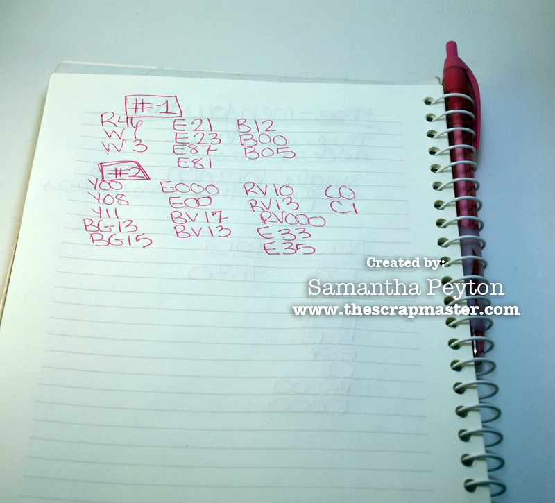
And on this next one, I tried out a new (to me) technique that I saw a video on. Suzanne Dean has a great video on this technique which can be found by clicking here.
Mine is not nearly as lovely as Suzanne’s, but practice makes perfect so I will work on it :O)
And this lighthouse image features some brand new Sketch colors: E23, E87, and E81 There are a total of 12 new sketch colors, all of which are available in the iCopic store.
So now that I have more images colored, I will be getting some cards made this week!

